


Our data visualization dashboard can also accept GPS tracker data from any wireless/ connected GPS tracker, especially LoRaWAN ones.
It has the following features:
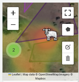
a. Smart clustering.
In case there are more than one trackers in a small screen area, it makes sense to cluster them up so as to avoid cluttering up the interface. This makes it easier to look at/ make sense of, large number of trackers even on a small screen. Zooming in or clicking on the cluster will expand it to show individual tracking units/ reveal further sub-clusters.

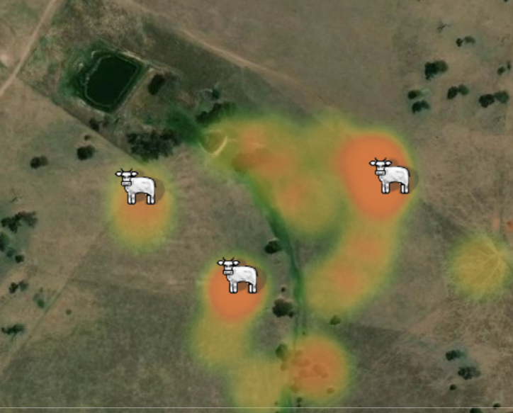
b. Heatmaps
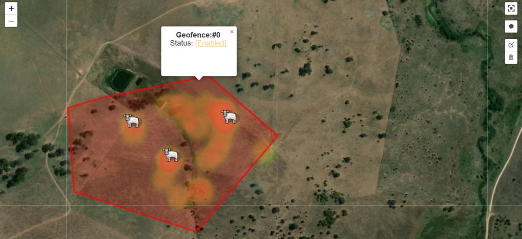
Heatmaps allow the user to visualize the most traversed regions of the map. In this instance, it becomes a good proxy to the patches of land where the cattle have grazed more.

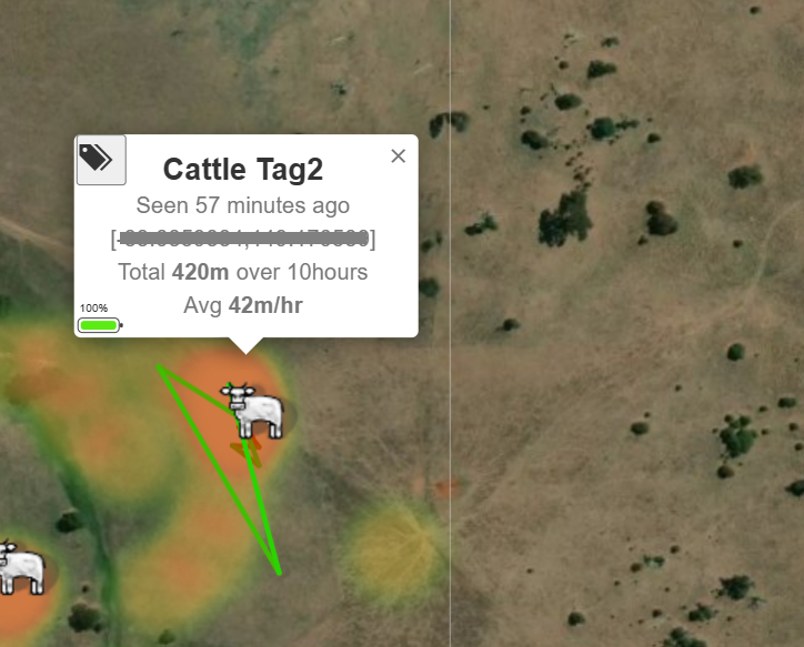
c. Path history
Clicking on a tag/ marker on the map reveals more information. For instance, it provides the battery value, the recency of the information, aggregate motion information and of course the sparse/ approximate path recorded.
d. Geofencing
The final feature is an easy click and draw interface to define one or more geofences that could be selectively activated/ deactivated. A geofence is an area defined on the map that would trigger an alarm (email/ WhatsApp) if a tracker leaves its area. This enables one to monitor if any of the assets have left a pre-designated area, indicating something abnormal/ a possible attempt to steal an asset.

In brief, our platform now offers the ability to easily add any tracker, visualize and to analyze the data generated.
To know more, as always, do reach out to us at info@tinkerbee.in right away! We’d love to hear from you 🙂
#maximizeYourLife


